Empowering Women with Negotiation Skills
perceived impact
Practice makes perfect
I worked as a Product Designer at CoEx Lab within the Human Computer Interaction Institute at Carnegie Mellon University. More specifically, I contributed to Negotium, a mobile app designed for women, by women to teach negotiation skills.
During our time on the project, the other designer and I created a negotiation practice feature equipped with real-time calls, LLM and AI-based chat practice, and a negotiation game.
How might we connect people to practice their negotiation skills together?
defining the problem
Turning diary study results into a design opportunity
As a starting point, the past designer had conducted a diary study resulting in a list of design and content issues. We selected high priority issues and then generated “how-might-we's” using Miro to frame the individual challenges.
From our “how-might-we's”, we determined that the one above would be most impactful to the application and ideated upon them.
competitive analysis
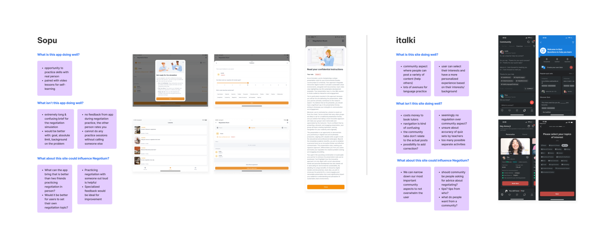
Analyzing similar applications to identify gaps and strengths
Sopu (the most similar app to Negotium) had a negotiation practice feature available, but with some key issues: the scenario description was too long and you had to set up the practice session outside of the application.
For italki, most of the features were locked behind pay walls, but they offered more community engagement via a forum where people could post a variety of content.
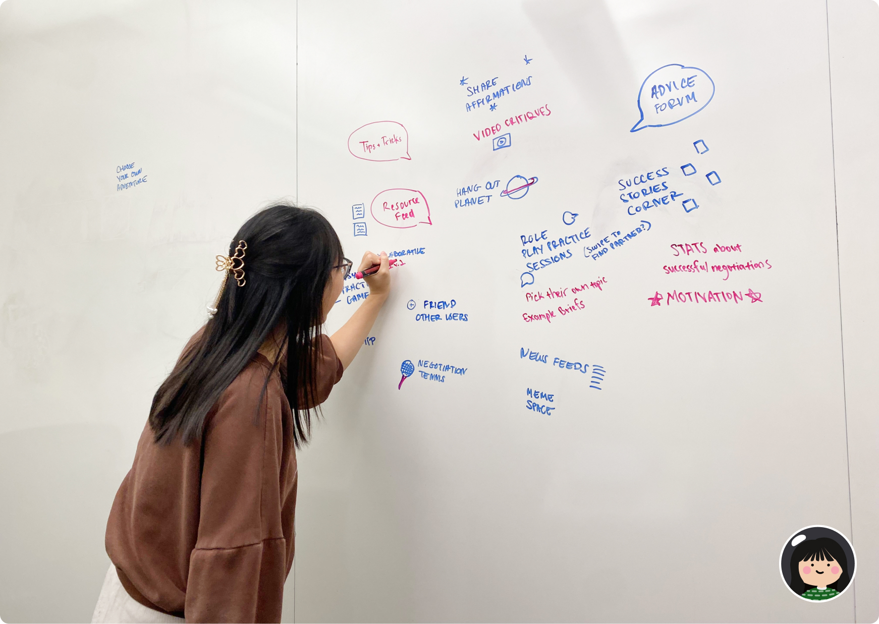
design sprints
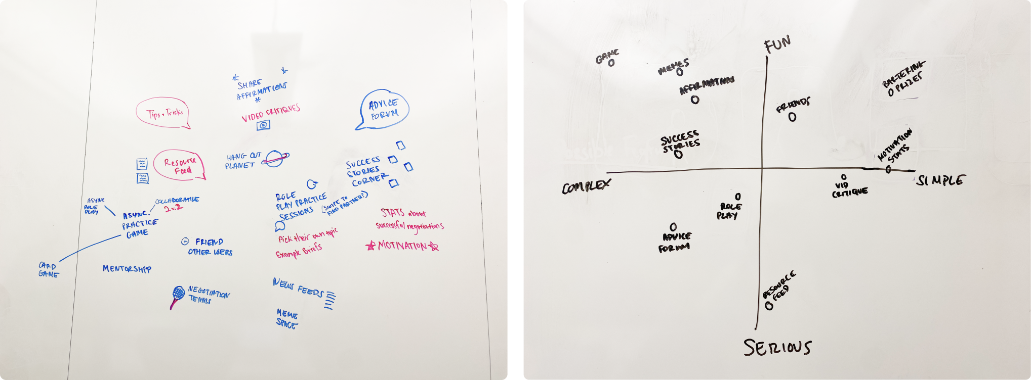
Sketching Crazy 8s to decide practice feature concepts
In 8 minutes, the other designer and I each sketched out 8 rough ideas.
From there, we narrowed down our concepts by starring our favorite concepts, which included chat and call negotiation practice and a story corner where users could post for the community aspect from my sketches.
convergent thinking
Converging down to 3 types of practice options
After discussing our top ideas with the whole team, we further narrowed down our ideas down to 3 concepts. My work focused on the first 2 types of practice options: chat and call.
- 1
Chat-based negotiation practice with AI feedback
Negotiation practice in chat form, where users can choose to text with a real person or a bot using an LLM. Either way, each version will receive real-time personalized feedback.
- 2
Live negotiation practice calls with another user
The most realistic practice option, where users can talk to simulate a real negotiation.
- 3
Pokémon-style multiple-choice negotiation game
A game where you can practice negotiating through selecting multiple choice answer.
Initial testing provided valuable feedback for future iterations
With a design system already in place, we could easily jump to high-fidelity prototypes to test with 5 users in our target audience. This step was crucial to making critical design changes that greatly improved the usability of our practice feature.
call sequence
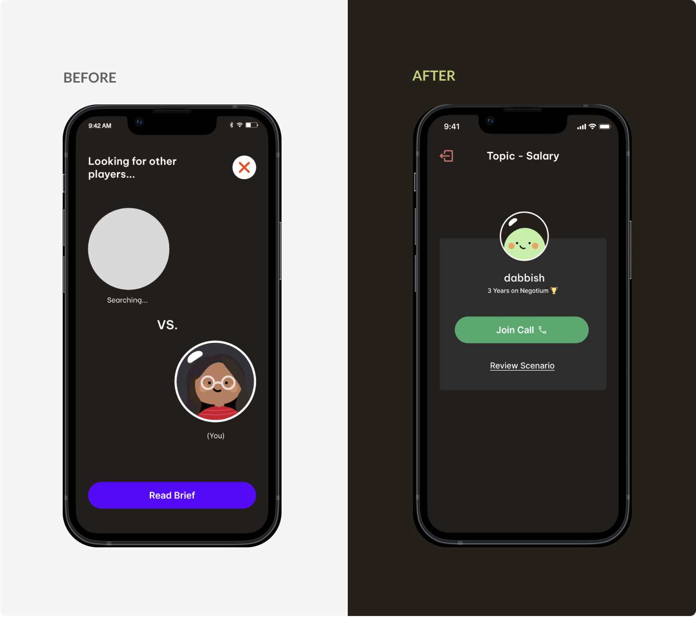
Providing users clear signifiers when joining or ending a call
3 out of 5 participants experienced confusion in the call experience.
The initial testing made me realize that users need strong indications of when a call is starting or ending.
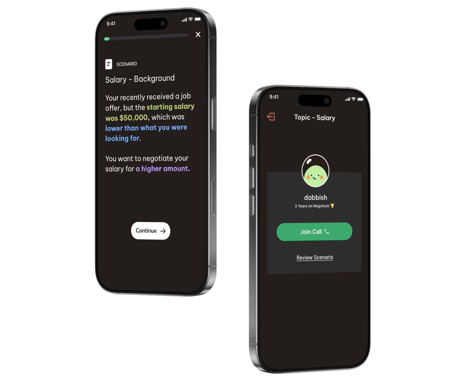
scenario description
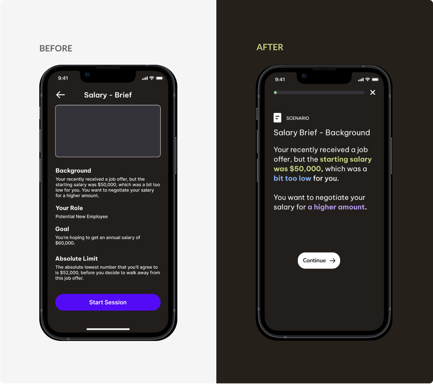
Improving readability by highlighting text and dividing content across pages
4 out of 5 participants didn't read or skipped over this section entirely because of the amount of text on one page.
To rectify this, I limited the amount of text per page and highlighted important information.
a challenge i tackled
Deciding how users access the scenario description when practicing in chat form
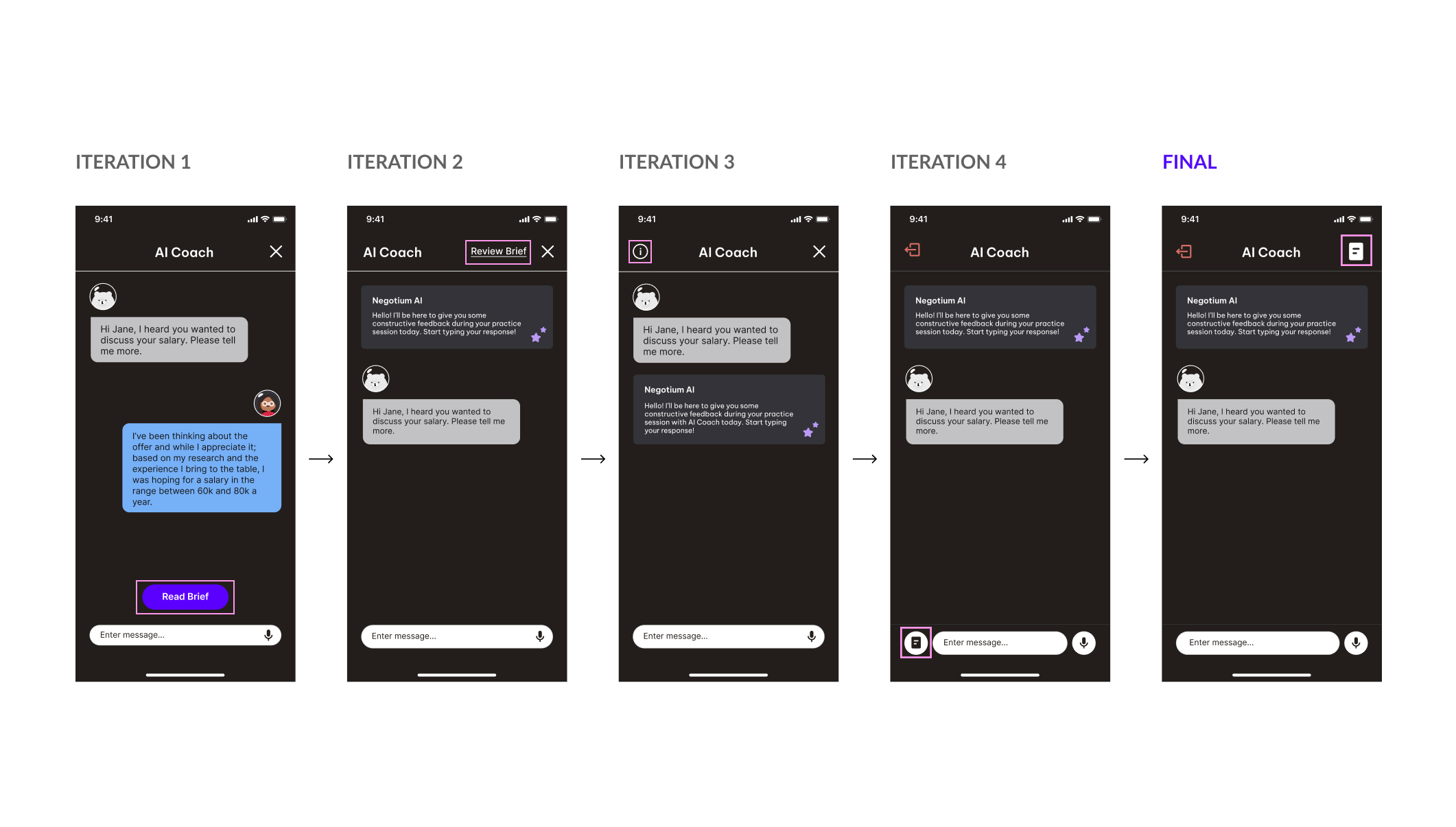
Before each session, users select a scenario topic to practice negotiating. To assist with scenario recall during the session, I provided a button to access the scenario description.
The button's placement, however, sparked considerable debate both among users and the team. As a result, I explored several iterations to determine the most intuitive location.
final deliverables
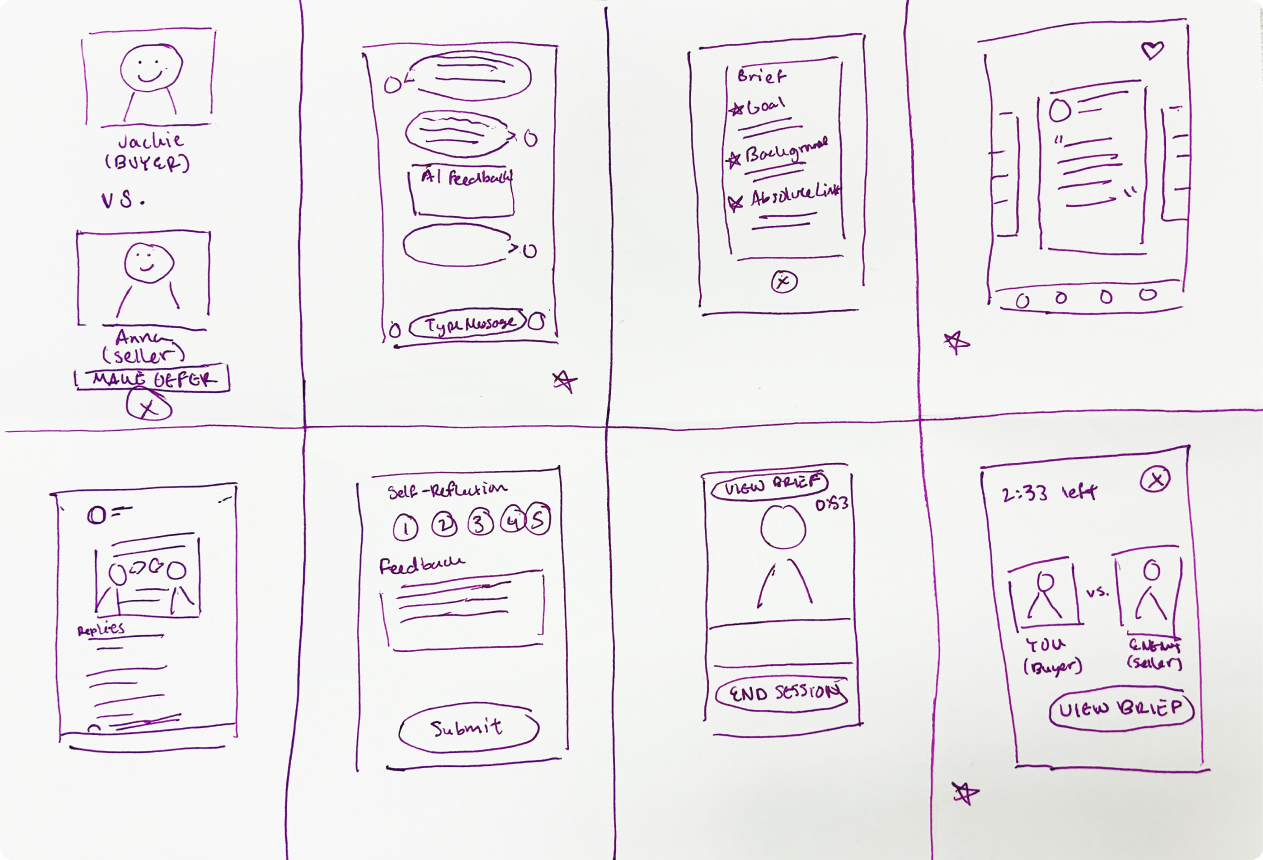
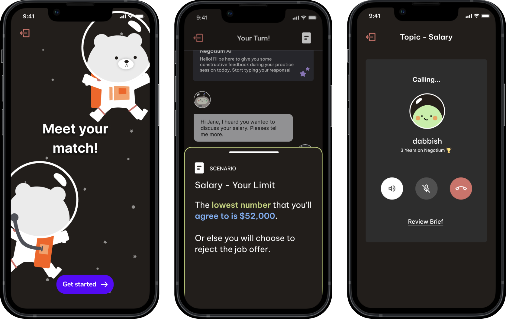
An end-to-end practice experience with 3 levels of practice options ranging from multiple choice, chat, and call
workflow 1
Negotiation battle using multiple choice
In this format, the user plays out a negotiation scenario with pre-defined choices.
This makes it easy for users to practice and learn different approaches in negotiation.

workflow 2
Chat negotiation practice with personalized AI feedback
In chat, you can practice negotiating either with a real person or a bot using LLMs.
This option gives you more opportunity to think about your responses and provides live feedback. (+ less scary than calling)

workflow 3
Live negotiation practice with another user
The closest you could get to a real negotiation.
The best way to improve your negotiation skills is to practice them with a real person.

guerilla testing
Validating our practice feature with a 2nd round of user testing
After creating the full practice experience, we set out into the wild to find potential users. With $5 Starbucks gift cards in hand, the other designer and I conducted guerrilla user testing by going to 3 different locations to find 5 strangers to test with.
All users were able to fully understand and use each practice option with ease.
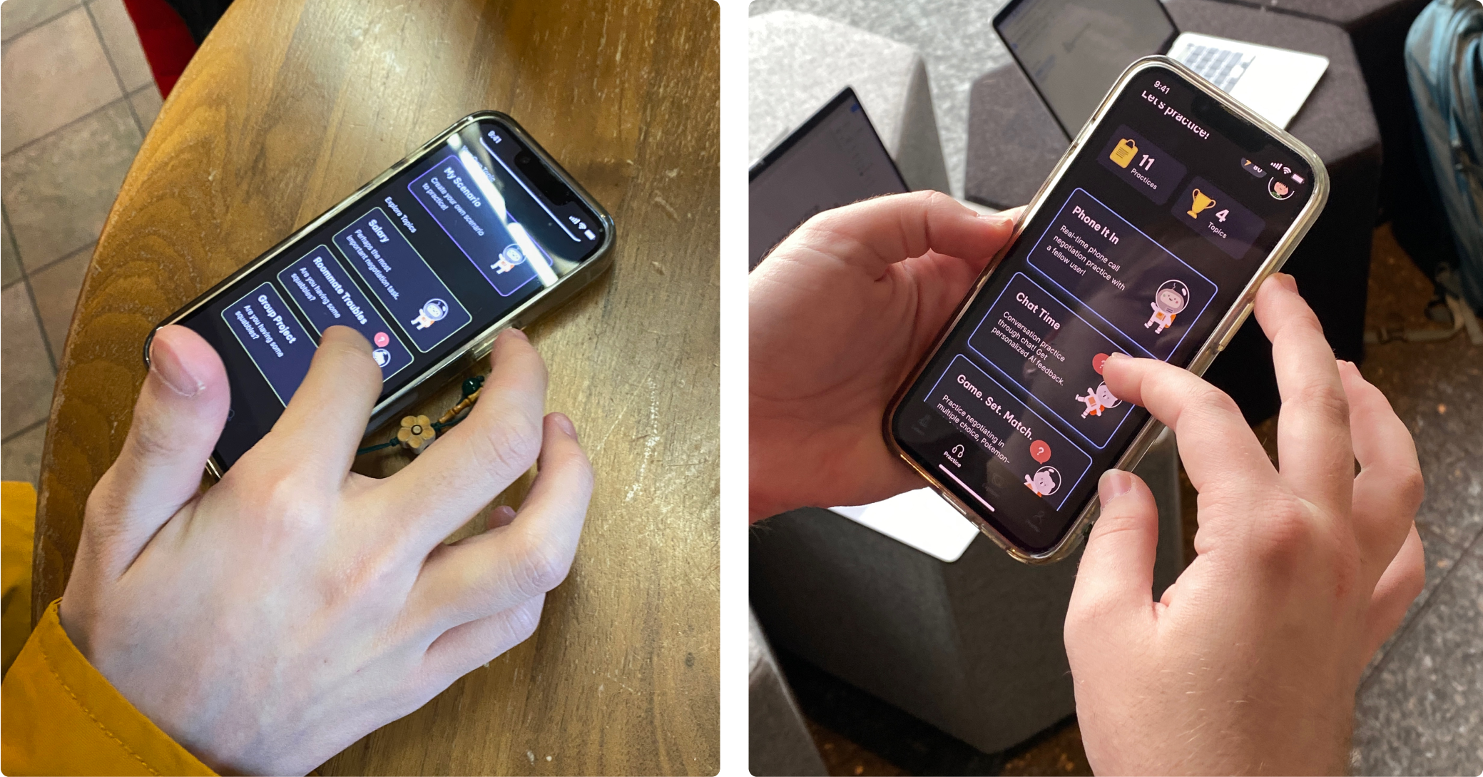
“The app was actually helpful. Yeah, because If I was negotiating with a real person, I'd be more ready.”
- Participant 2
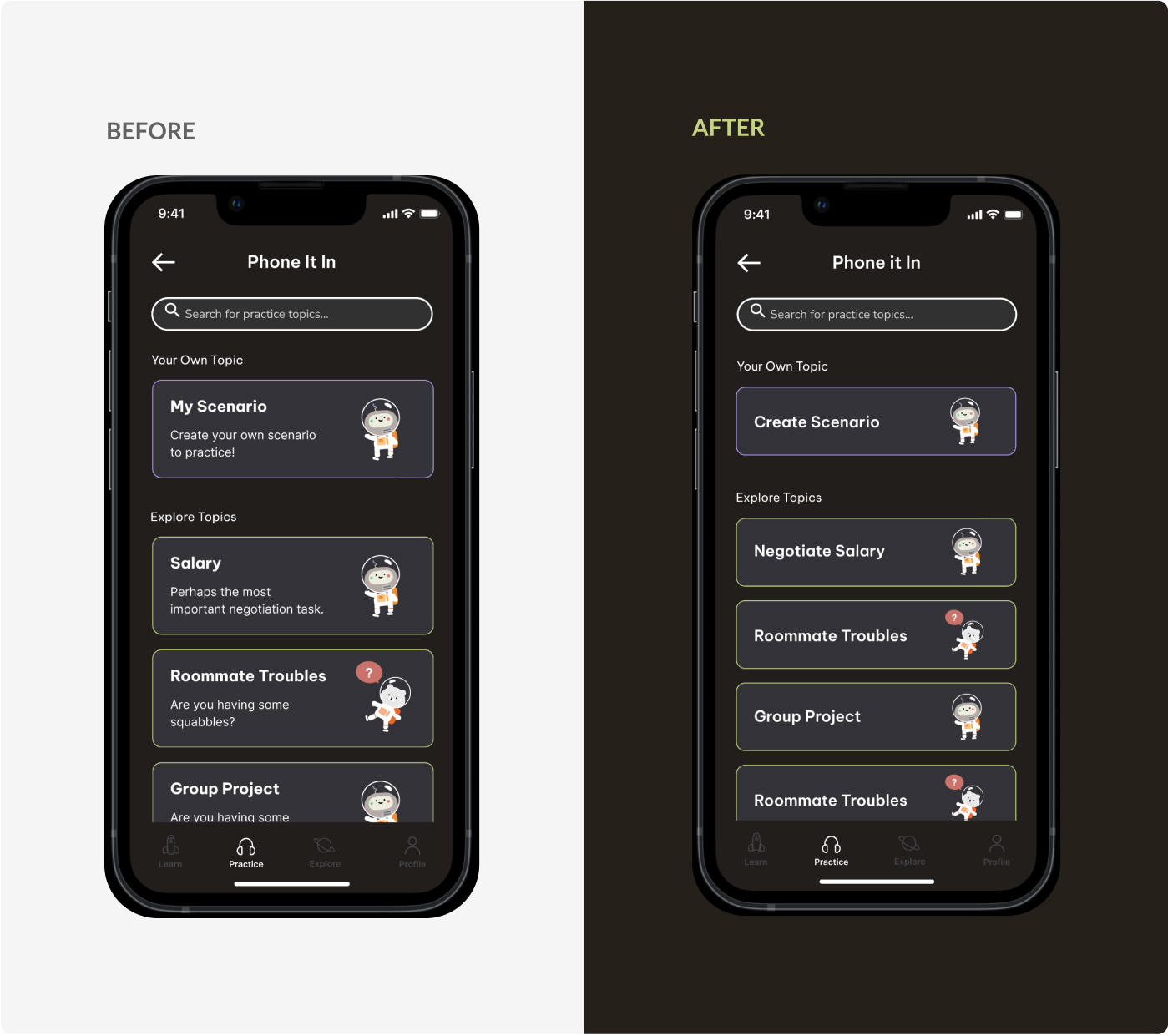
final changes
Addressing user confusion
3 out of 5 participants got distracted by the subtext included in the individual topics. It interrupted their experience and they didn't find it necessary.
In response to user feedback, I modified the content to only include the topic titles.
final thoughts
User feedback is vital at every stage of the design process
This project taught me just how important user feedback is throughout the design process. The feedback we received from our initial concept testing helped me to significantly improve the usability of the feature.
- 1
Dealing with ambiguity
We defined our own problem space by prioritizing key issues and focusing on one feature.
- 2
Accepting that people don’t read
This project gave me a harsh reminder that people do not like reading large amounts of text, especially on a phone. The less text there is, the more likely someone will read it.
Myself working on the whiteboard with mini me I created in the app!