Streamlining Form and Scoring Experiences
impact
Simplifying workflows for 2 distinct users
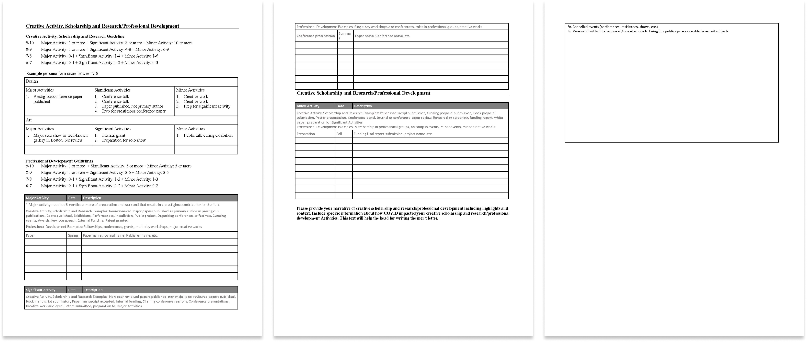
Every year, Northeastern University's College of Media Arts and Design (CAMD) faculty are required to fill out an exhausting 10-page paper form to track their completed activities to earn merit. The Merit Committee then sorts through 100s of forms to approve activities and manually assign scores.
This tedious process led our client, Mark Sivak, head of the Merit Committee, to task us to create a digital solution to streamline the process for both faculty and the Merit Committee.
How might we streamline the activity organization process to make it more efficient than the traditional paper form?
research
Paper form walkthrough revealed repetition & inefficiency
During our beginning meetings with Mark, we saw firsthand how tedious and tiring it was for faculty to fill out these forms. Most faculty chose to fill out the form all at once by trying to remember activities they did off the top of their head.
This made it extremely difficult to categorize their activities into the 3 main categories. Filling out the form involved a lot of flipping back and forth between the different pages.
iterations
Condensing necessary information to one page to reduce facultys' cognitive and physical efforts
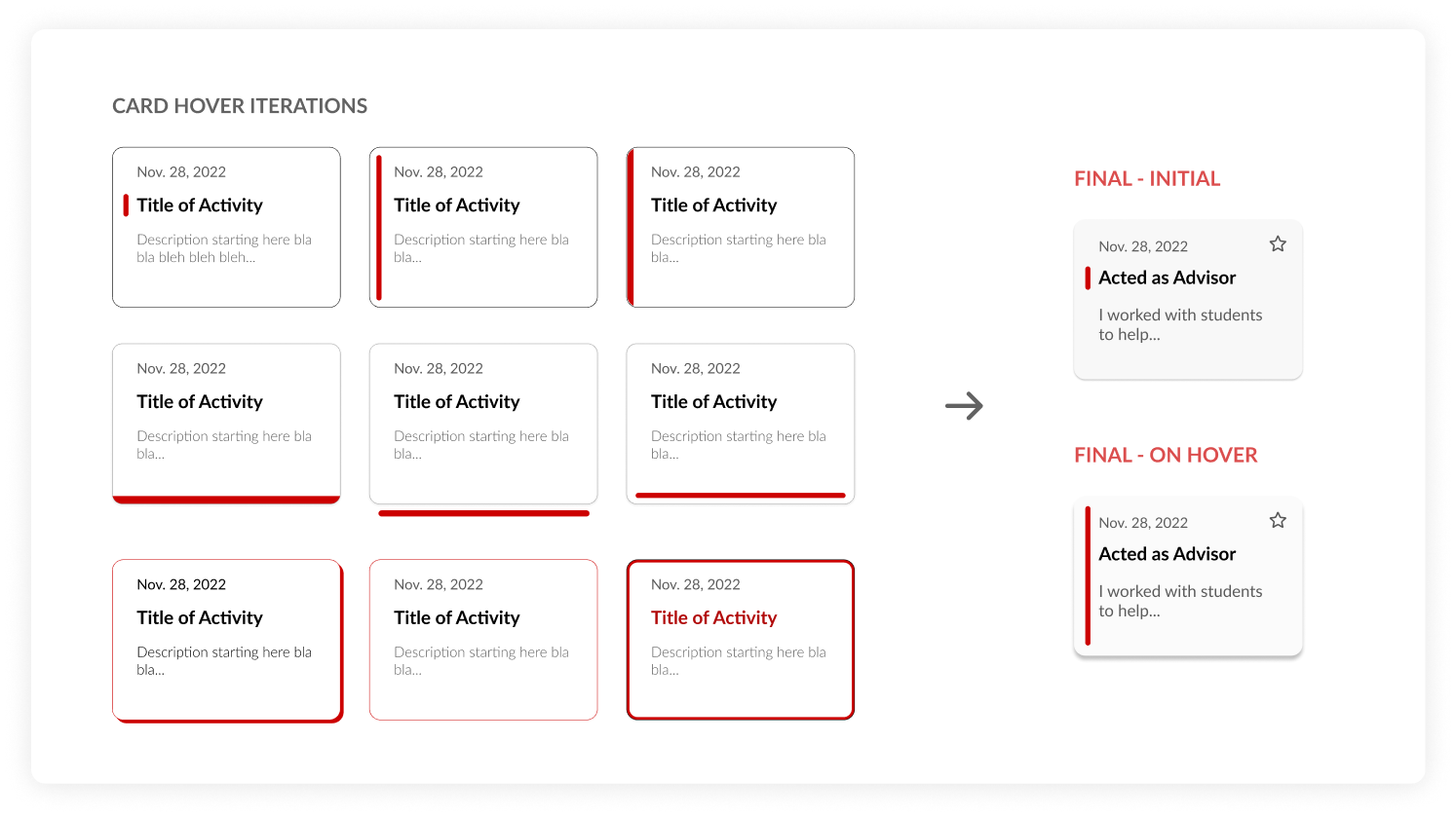
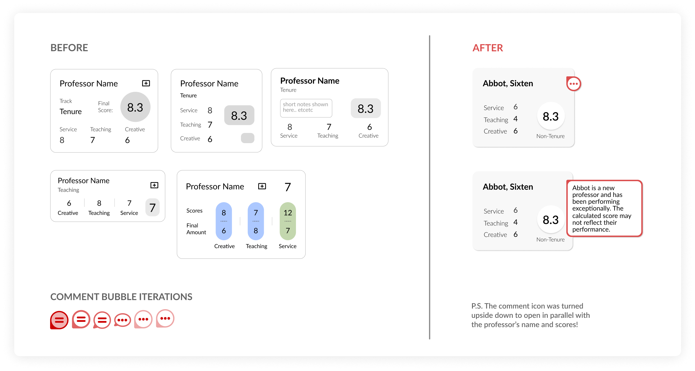
Adding Micro-Interactions for Utility
After discussion and critique with the team, we settled on an activity card design. Then, I decided to create a hover state interaction to clarify when a card is selected.
This added a delightful element to the page while simultaneously creating a better user experience.
solution
Create a digital form layout that sorts the activities into each category for you

design guidelines
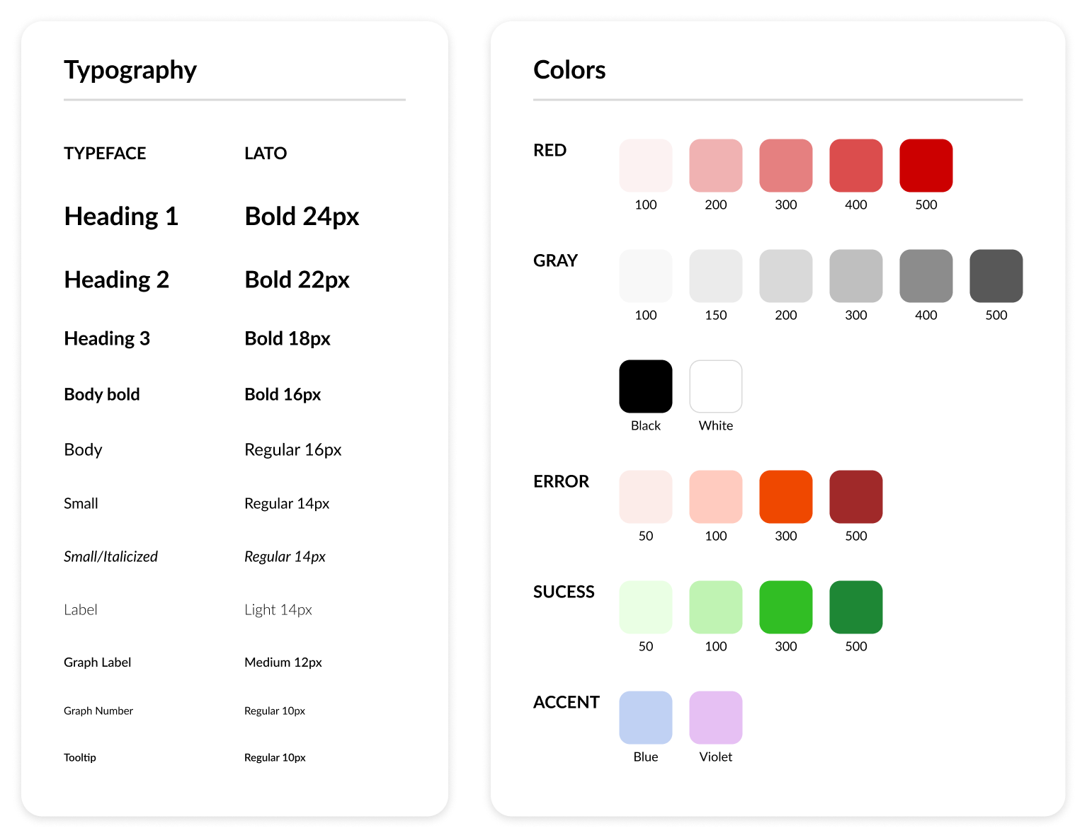
Creating clear design guidelines for developers and future work
We created design guidelines to maintain consistency throughout the website to improve user experience and provide developers with a reusable pattern.
Internally, we re-organized the Figma file to improve navigation and documentation.
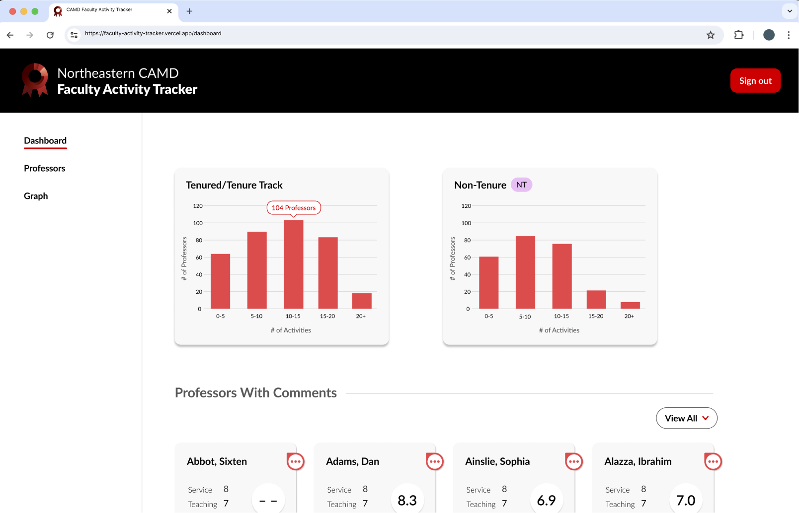
Now let’s turn our attention to our second main user: Merit Committee(MC) members. Our goal? Helping them score faster.
ideation (again:))
How might we help MC members score the faculty members submitted activities faster and fairly?
During my second semester on this project, we shifted gears to focus on the Merit Committee's side of the application. The Merit Committee's members main priority was to quickly and accurately score the faculty's submitted activities.
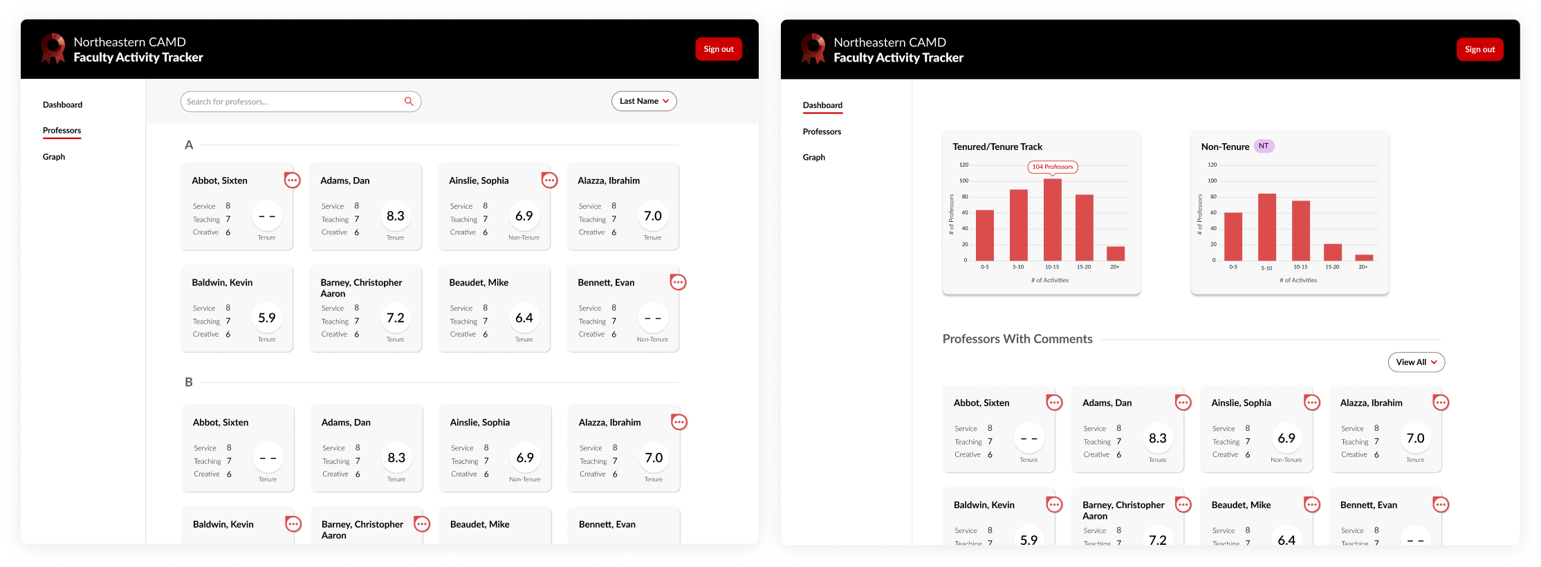
For this side of the application, the client made a few requests. In the dashboard of the professors' submitted activities, he wanted to be able to see individual activity scores, final score, and any comments that were added by other committee members.
iterations
Completed 20+ iterations which led to using visual hierarchy to highlight the final score
For the professor cards, the other designer and I did rapid iteration to figure out the best layout to help the Merit Committee understand each professor's scores at a glance.
In the final design, I improved the card's visual hierarchy through highlighting the final score through shape, color, and size.
problem solving
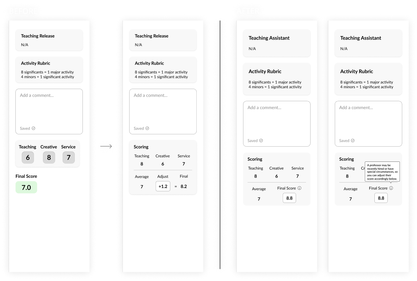
Creating a scoring system that offered the easiest and fastest way to adjust scores
We simplified the Google Sheets version of this process on thea digital application by creating the scoring island.
Midway through iterations, I shifted our thinking from adding to the score to directly writing out the adjusted score. This shift allowed us to create a single input box to help users avoid confusion and unnecessary mental math calculations.
final deliverables
Created an end-to-end experience for both faculty and MC members from login to scoring


final thoughts
Being on a 7-person team for a project that helped an entire school department helped me learn, grow, and empathize
This project was really where my design and leadership skills began to grow, and I had an amazing team. P.S. Half the reason, I picked this project was the funny acronym (Faculty Activity Tracker), which my teammates also thoroughly enjoyed :)
- 1
Facing ambiguity
There was a lack of onboarding for this project, so I became more proactive with asking questions and requesting to be apart of client meetings.
- 2
Chatting with devs
It was an invaluable experience being able to directly communicate with the developers, discussing ideas and certain intricacies of the design.
- 3
Getting feedback from the people
Looking back, one of my main regrets for this project was the lack of user testing and research. The people using the application must always be involved in the development.
My amazing team <3